Hexabot Manager App
Summary
This year DesignFlows, sponsored and organized by Bending Spoons, challenged participants to imagine user interfaces in an alternate 2025, where humans permanently inhabit the Moon and Hexabots assist them in daily life. My project explored this parallel scenario through grounded, modular UX, despite time limitations.
A Feasible Interface for a Fictional Future
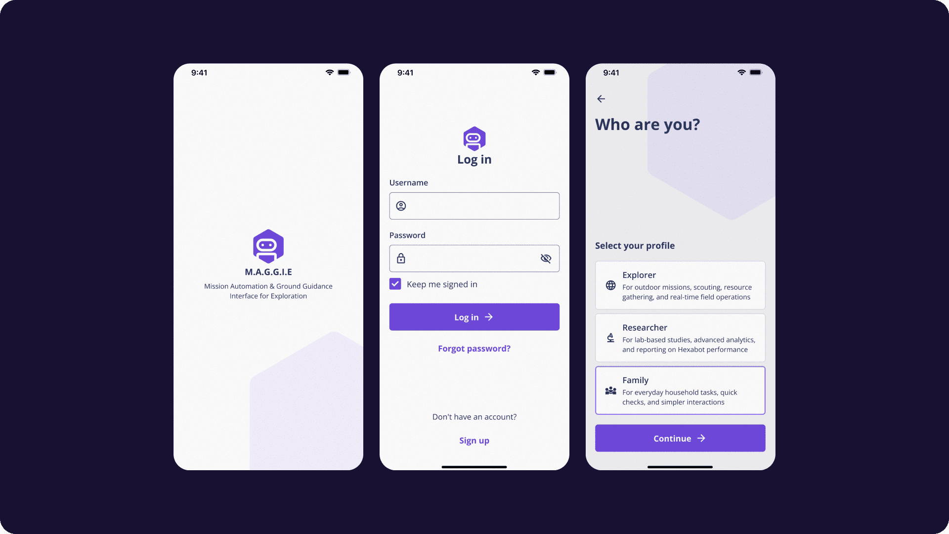
The brief imagined a sci-fi scenario, but I chose to approach it as a real design problem: what does a reliable, voice-accessible, mission-critical UI look like when used by both researchers and civilians in constrained environments?
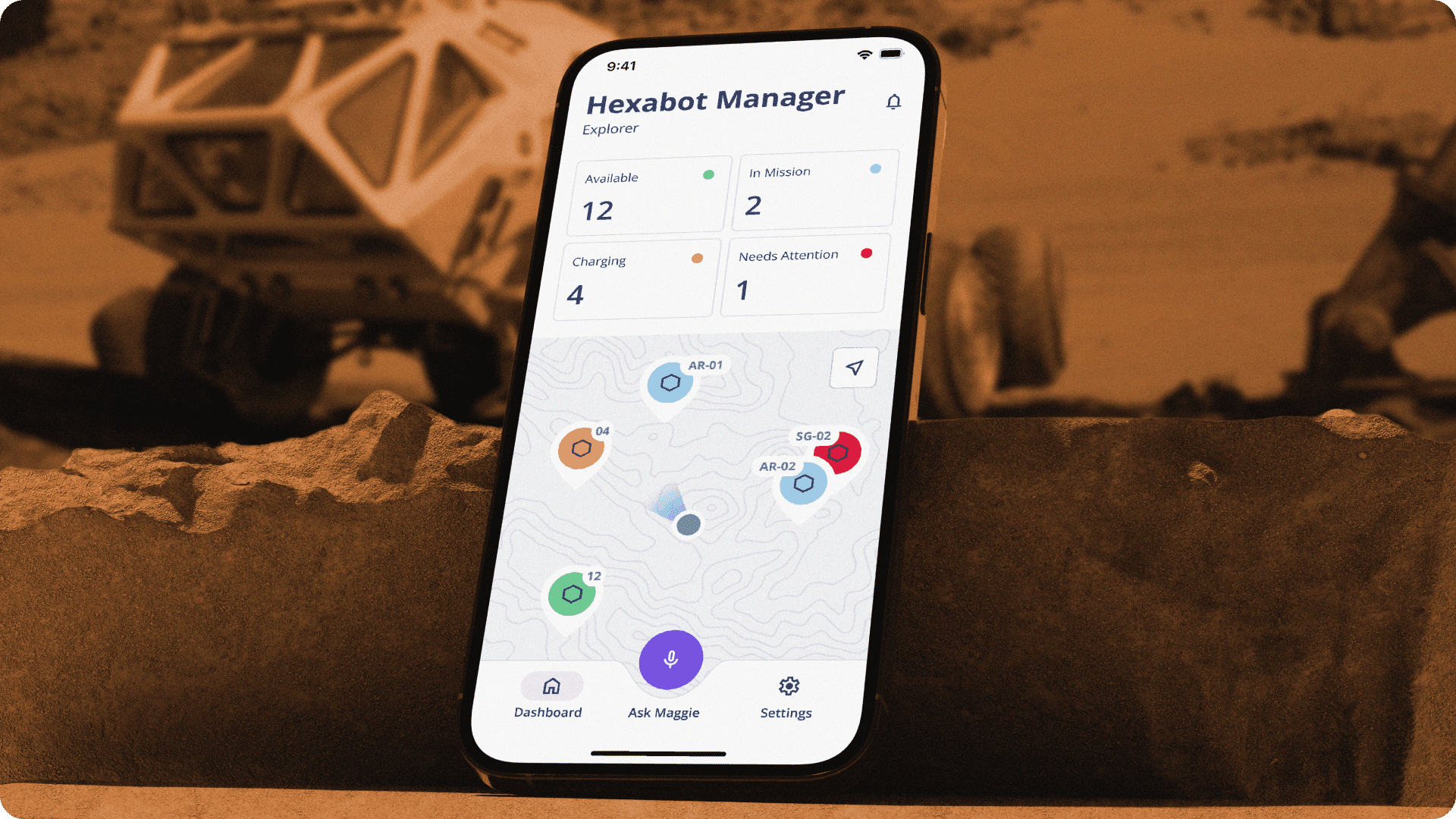
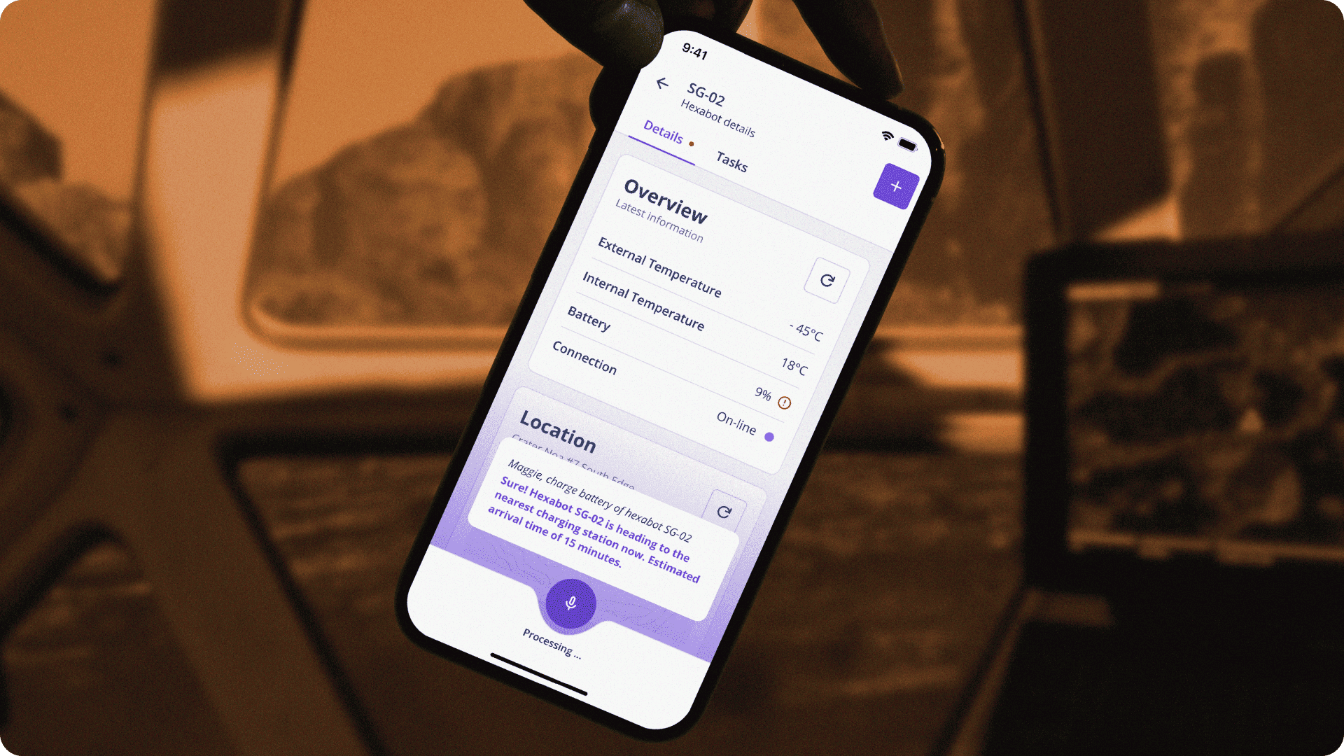
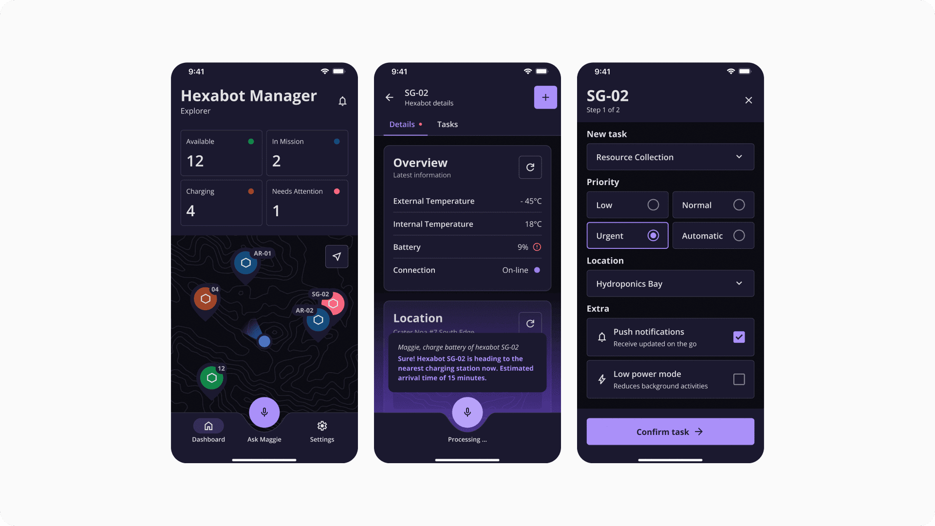
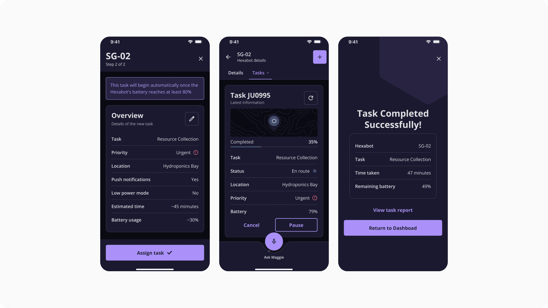
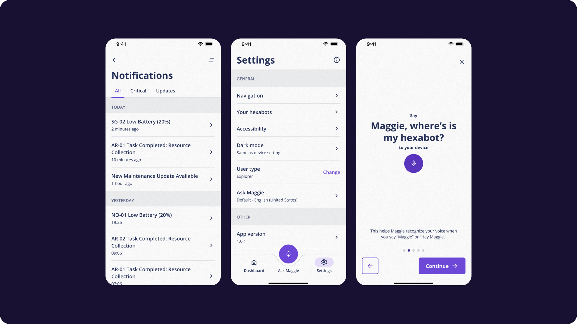
I focused on feasibility over fantasy. Every screen was designed to be modular, scalable, and understandable, without relying on exaggerated futurism. Inputs are large. Feedback is direct. Tasks are clear. Commands can be issued by hand or voice, useful for glove-bound users or in motion-restricted environments.
This was not a visual experiment. It was a UX study in abstraction, accessibility, and decision friction.The interface adapts to researchers planning experiments and civilians managing daily logistics. Features were prioritized based on urgency, context, and action reversibility.
What I Learned
This was a low-fidelity submission, designed during the same period I was preparing for another challenge, where I placed first. With limited time, I prioritized clear flows, interaction intent, and prompt clarity over polished visuals. Designing under constraint helped focus on what matters most: (1) one interaction per screen, (2) one voice command per action, and (3) one UI system for distinct user types.
In retrospect, I think my mistake was being too attached to feasibility within the uncommon scenario of the challenge. That mindset led me to a simpler, perhaps less imaginative solution compared to the top 40 selected for the finals.
DesignFlows reminded me that speculative design is strongest when it dares to go further — even if we’re on the Moon. 🚀
.svg)