Material Design Expressive Music App
Summary
OttoTune started from a simple problem I faced during music rehearsals. Most chord apps were messy, full of ads, and hard to use when I needed them most. I built OttoTune to fix that. This post explains the design process, the choices I made, and how the app supports musicians in real-time.
Why I Built OttoTune
I play music often. But instead of spending time playing, I was wasting time fighting apps that didn’t work well. Some were overloaded with features, others crashed offline, and almost all of them had annoying ads.
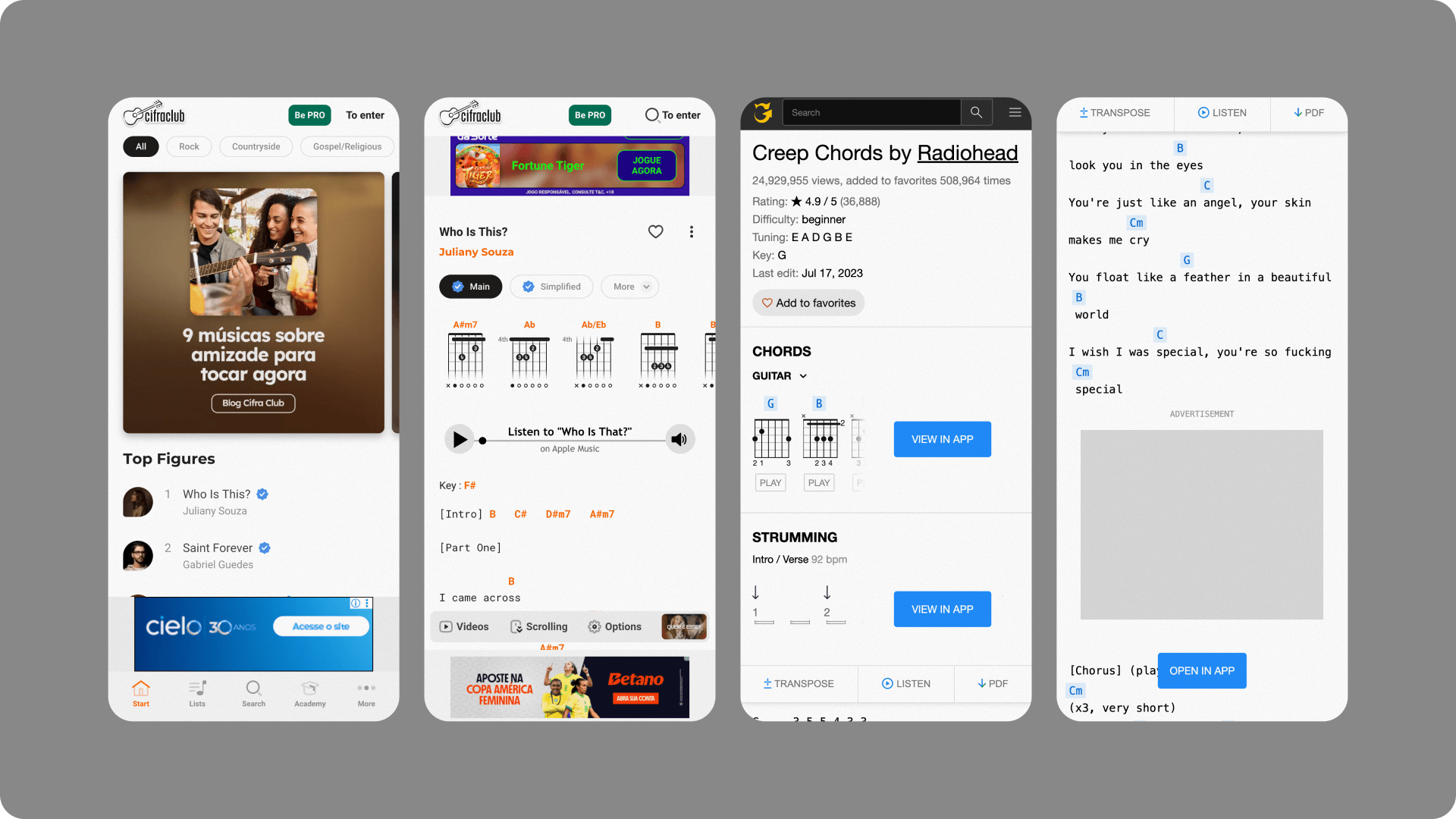
“UG sucks, man. Can’t even play without bombarded with ads and having to scroll a comically large amount to see the ****.” Reddit, r/Guitar
I needed something clean, fast, and easy to use. OttoTune is what I made to fix that.
What Musicians Really Need
Musicians don’t want to dig through menus or fight with bad layouts. They want to find, write, and read chords quickly. They want an app that works during a live session or a practice break, no distractions and confusion.
“Smart chords has a song book section where you can import tabs from UG but use them without the junk.” Reddit, r/Guitar
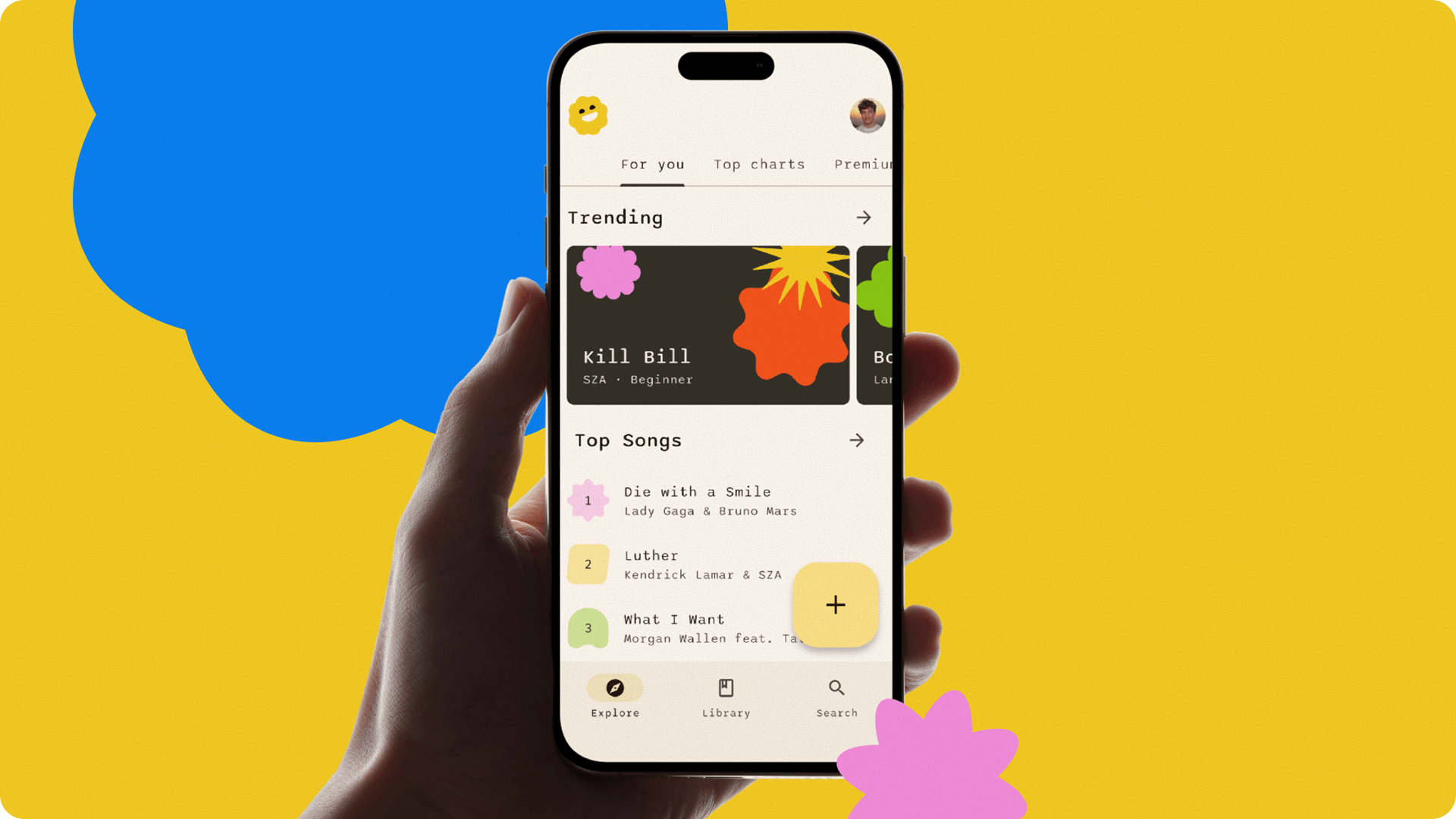
OttoTune is designed to do only what matters: (a) start a new song with one tap, (b) switch between editing and playing without losing focus, (c) read chords with auto-scroll and clean text, (d) find saved songs fast without digging through menus and (e) work offline with zero issues.
Clean UI That Follows the Way Musicians Think
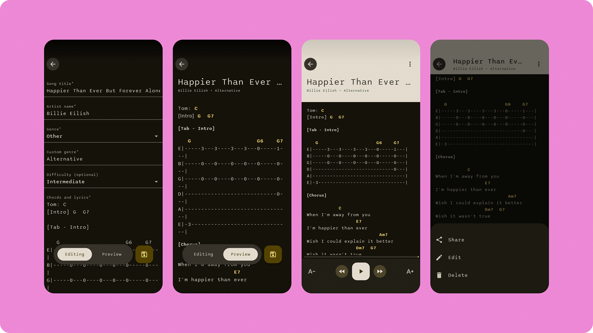
OttoTune works like a musician thinks. Fast start, seeing only what is needed, staying focused. When creating a song, the editor opens with only the basics: title, artist, and genre. The preview is right away. The chord area uses clear spacing, strong contrast, and auto-scroll for performance mode. Font size can be adjusted too.
In the library, the songs can be viewed as a grid or a list. Grid view is colorful and helps with memory. List view is good for fast scanning.
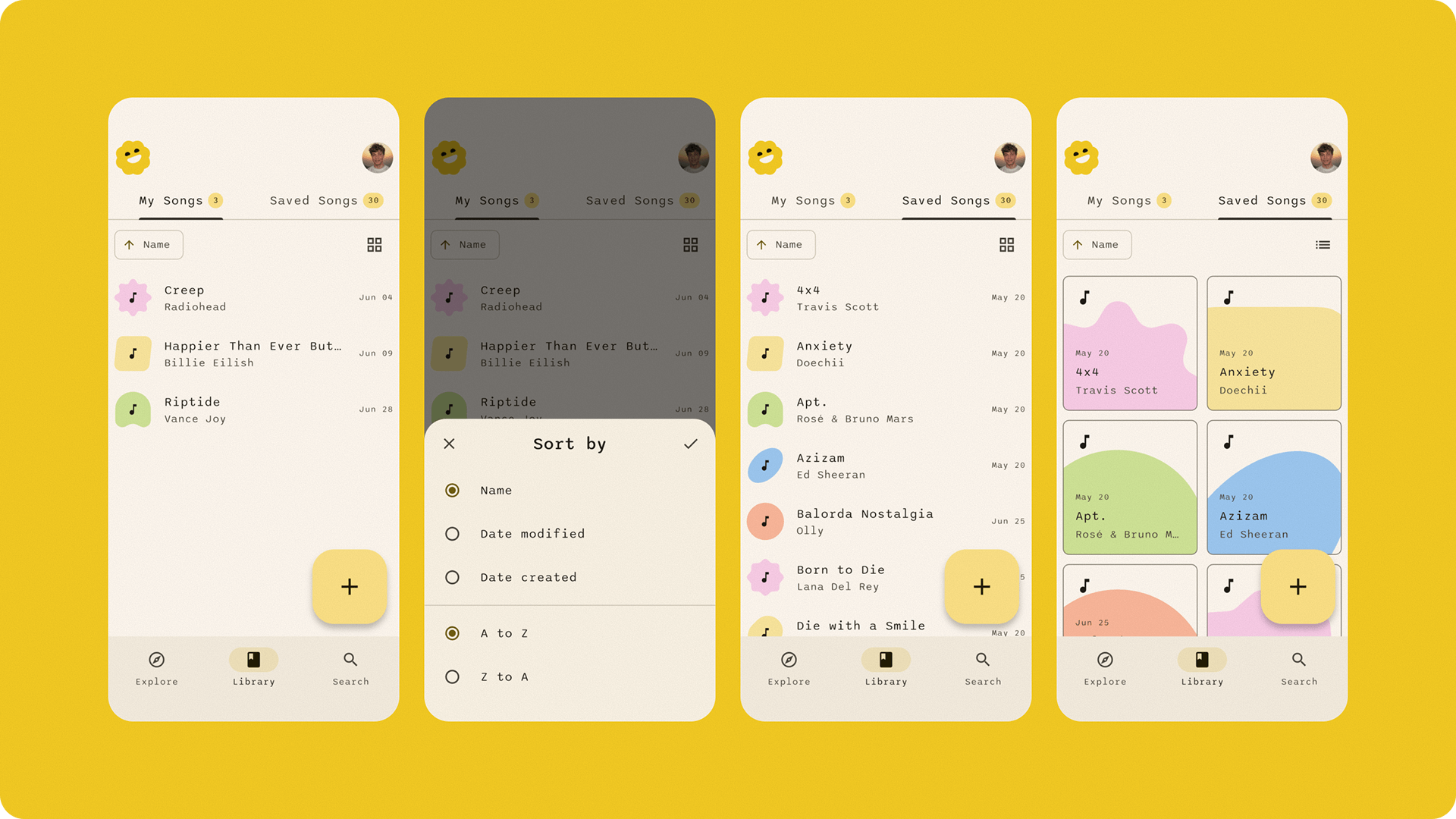
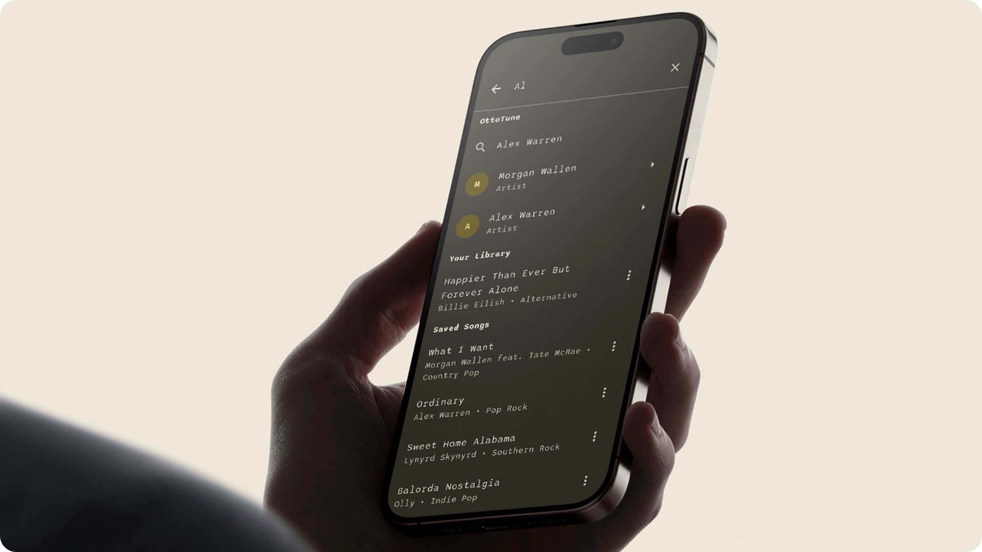
The search screen is split into three clear areas: personal songs, saved songs, and suggestions. This avoids confusion and scrolling.
“Even on my phone I switch to the desktop version of the site.” Reddit, r/Guitar
That type of frustration is exactly what OttoTune avoids.
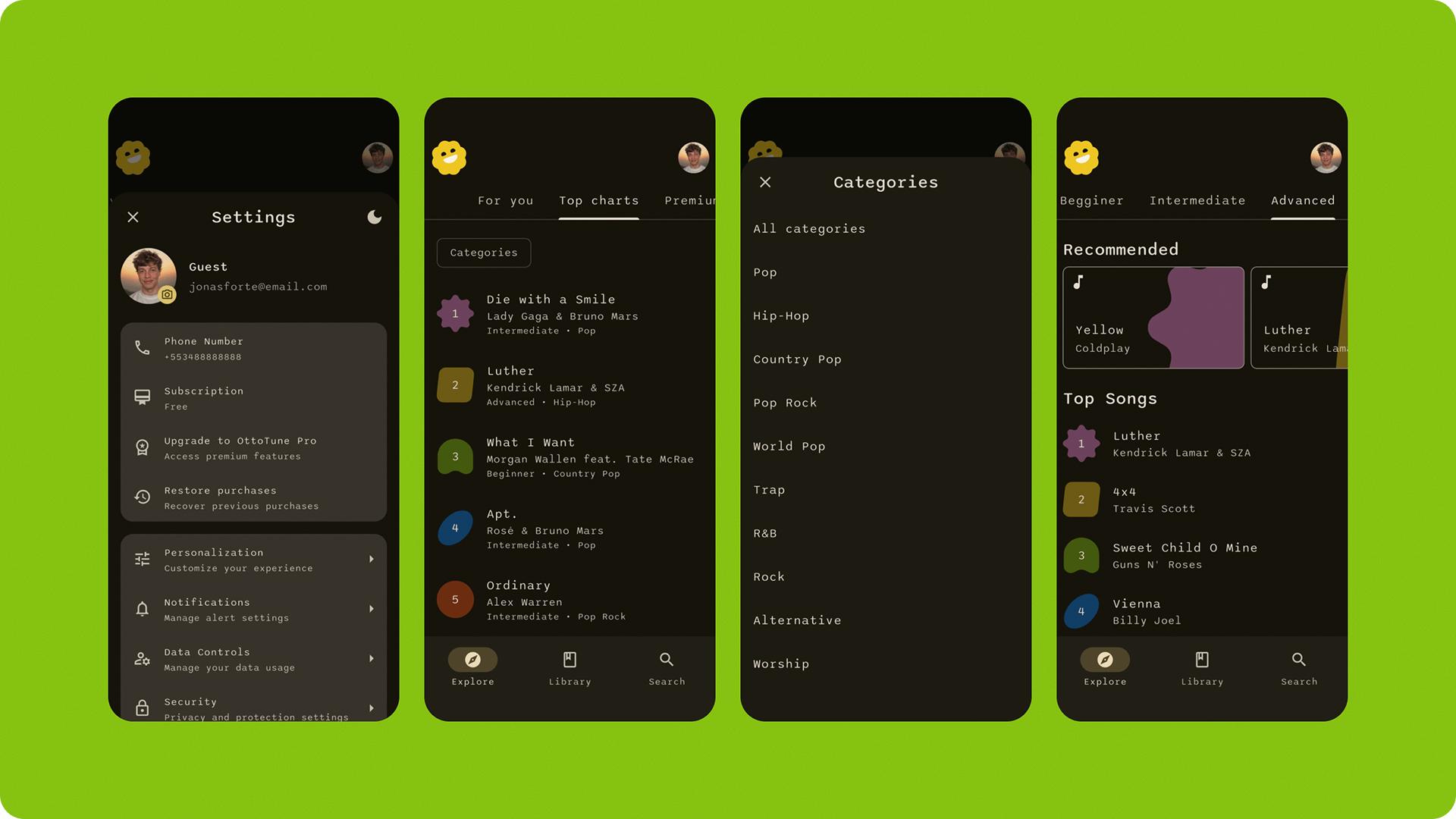
Discovery That Feels Personal
Many apps push songs that users don’t care about. OttoTune keeps discovery simple and useful. You can filter songs by genre, skill level, or mood. The system updates instantly. No extra steps or hidden settings.
This helps finding what fits user' current practice or jam session, without breaking flow.
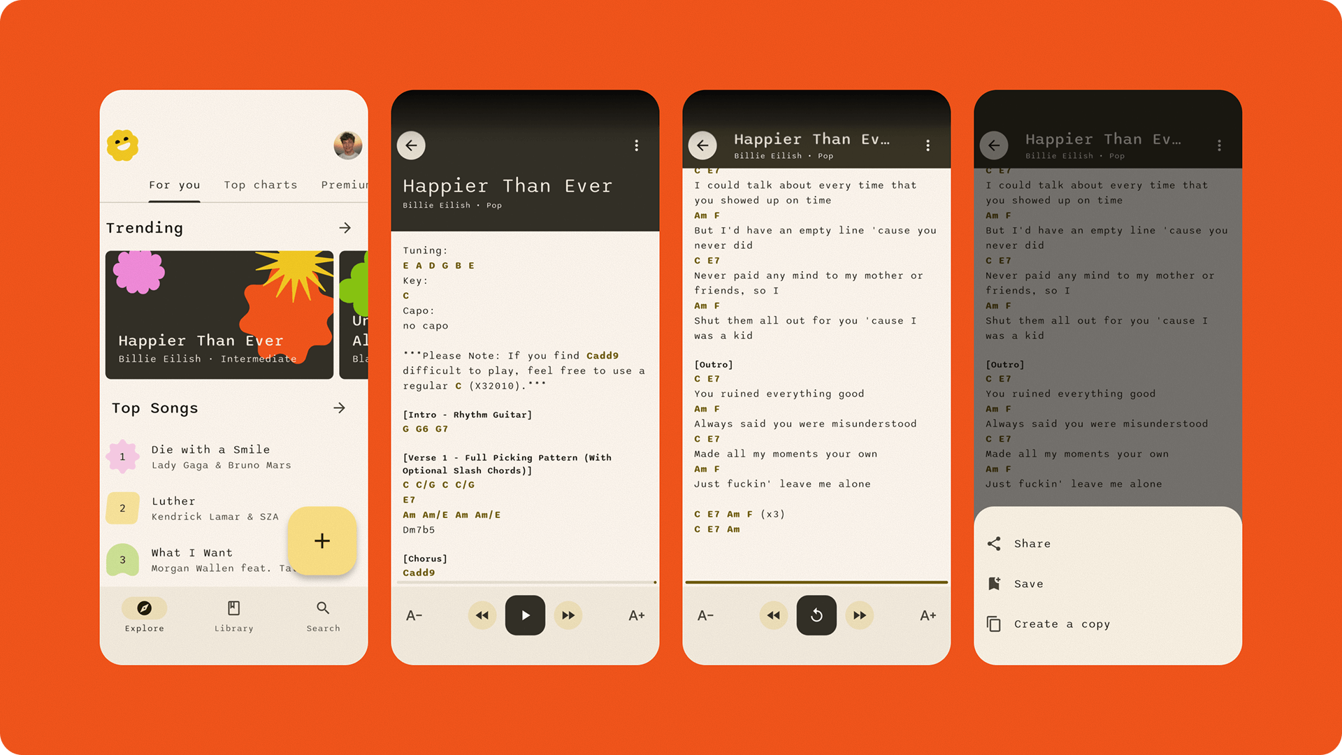
A Song Reader Built for Live Playing
The song screen is designed for live performance. Chords stay aligned with lyrics. The background is calm and high-contrast. Extra features like sharing or saving are hidden in a bottom sheet so they don’t distract.
Everything supports quick reading and real-time use.
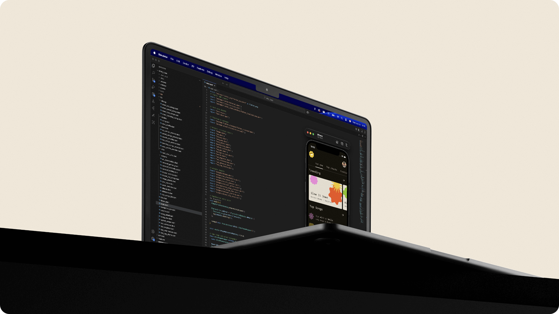
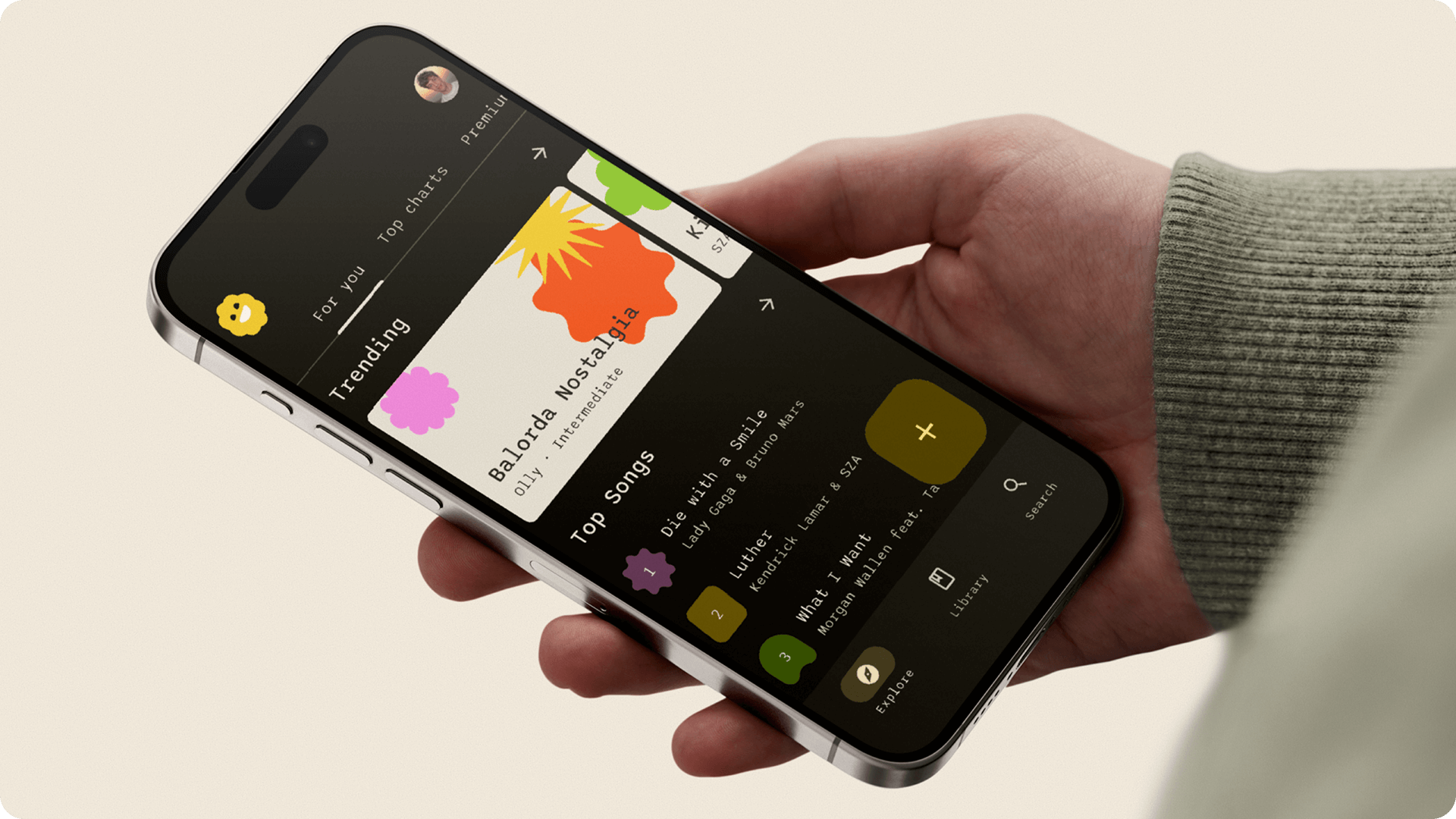
Built in Flutter with Material 3 Expressive
OttoTune is made in Flutter. Every screen uses Material Design 3 Expressive. This lets the app feel modern and clear. Colors guide your attention. Text is always readable. Spacing helps with rhythm. The UI doesn’t just look nice. It feels right when you’re using it while playing music.
What I Learned While Building OttoTune
In short, (a) real needs make design better, (b) clean visuals mean nothing without clear structure, (c) live use reveals what matters most and (d) musicians work in flow, not steps.
Final Notes
OttoTune is not trying to be everything. It’s trying to be useful. It was built from real frustration, tested in real practice sessions, and designed to support real music. Starting from real need leads to better product decisions.
.svg)